UX/UI: Online Wholesale Marketplace
Project Summary & Goal
With growing online competition and wholesale marketplaces popping up left and right an initiative was created to expand OneCoast’s online business with a competing marketplace. Designing a similar experience and slightly new user interface compared to OneCoast.com ultimately being the goal.
Obstacles
Tight turnaround time and developer workloads were major obstacles in this case. In addition to designing another marketplace experience we had the task of creating a brand and business model from the ground up which created many roadblocks and setbacks during the design process. Another obstacle on the user experience end was creating a website with differentiators in the wholesale industry, specifically online.
Research
Competitor research was done early on in the process in comparing how other major online wholesale websites were designed and how they functioned. Using our existing data from OneCoast.com was really helpful in deciding which features should stay and where we needed to get a bit more innovative in how we treated the retailers. OneCoast’s business model was created primarily for road sales, making territory managers and salespeople the breadwinners of the company. The new wholesale marketplace would solely operate through online sales so we needed to up our customer service game.
Sketches & Wireframes
When wireframing I knew we were keeping a lot of the same layouts that existed on OneCoast.com but needed to revamp the look and feel with new branding along with new features and different treatments for specific pages. I started with the overall hierarchy and taxonomy of the website as those changed quite a bit based on the business model and worked through the wireframes needed for development from there. I color-coded the taxonomy so that development knew what was old and being removed and what was a new addition to the structure.
Taxonomy & Wireframes
While working through the taxonomy I collaborated with the development team on updates and changes to our current website that they could migrate to the new website.
One of the major ommissions was that of the sales rep team. Removing them from the business model and website experience simplified it quite a bit, however, there was a need for more accessible customer service. The solution was to add a live chat feature along with replacing any mention of the sales reps with a contact customer service call to action.
High Fidelity Designs
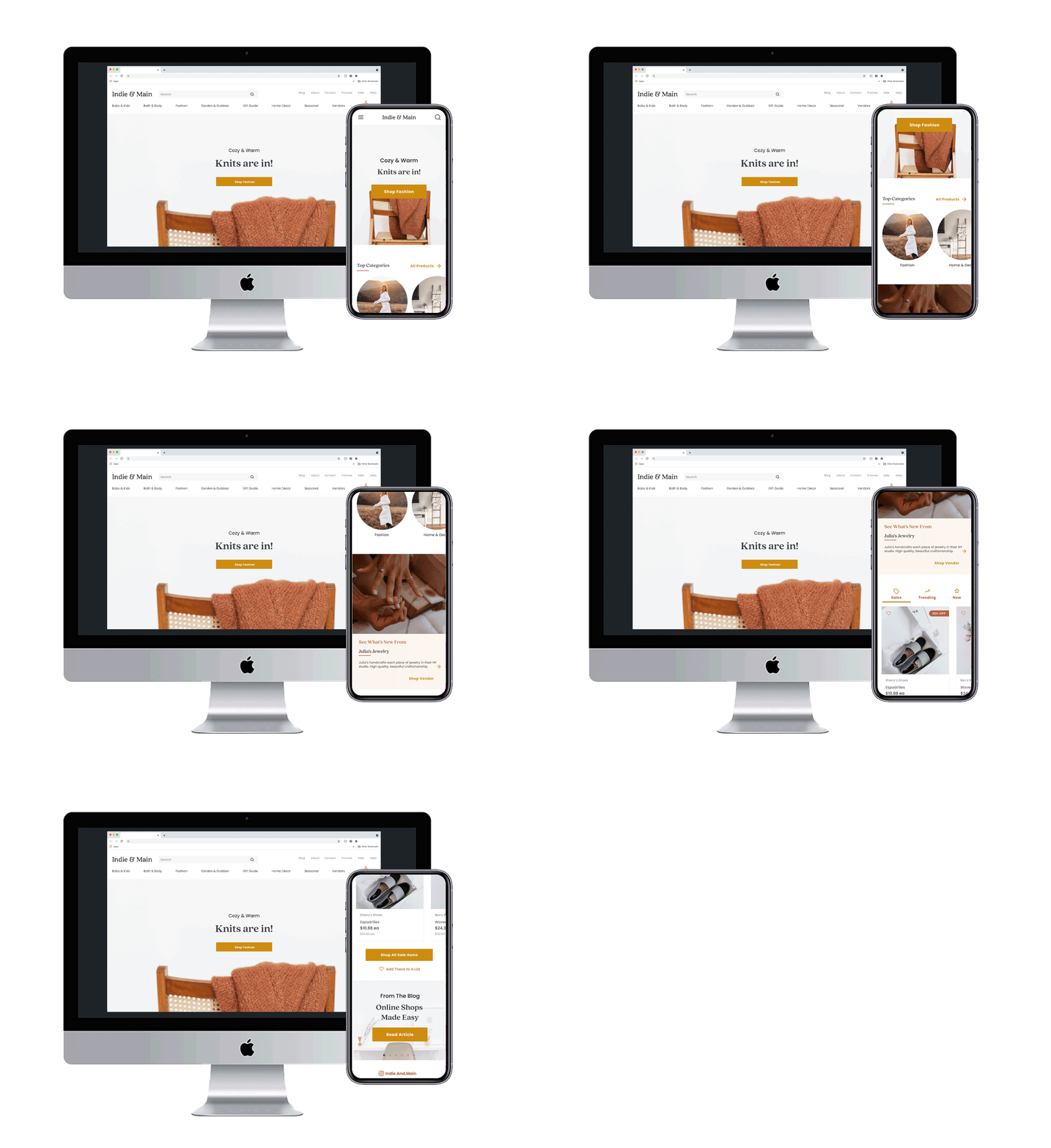
Using Figma I set up a design system and applied the branding, colors, fonts, etc to the designs. I used stock photography that spoke to the brand in order to use the prototype as a sales tool to recruit wholesale vendors.


